Deep Learning with IMDb Movie Ratings and Genres
Color Trends over the Last 150 Years
Can you judge a movie by its poster?
Upload an image of a movie poster or click on one of the examples to see if a deep learning algorithm
can predict it's IMDb Rating and Genre.
Where does your selected movie stand against the 39.2K sampled IMDb movies?
No movie poster selected.
Predicted IMDb Rating
⭐
Genres (Confidence)
IMDb Rating Descriptive Statistics
Count
Mean
Std
Min
25%
50%
75%
Max
39,259
6.41
1.145
1.2
5.8
6.6
7.2
9.5
Other*: Thriller, Western, Fantasy, Mystery, Family, Romance, Sci-Fi,
Musical, War, Musical, History, Film-Noir, Adult, Talk-Show, Sport
Dataset Summary and Motivations
The movie rating and genre prediction algorithms were trained on a
dataset of 39.2K movie posters found on Kaggle and
from
the IMDb datasets website.
The movies date back from 1874 to the present day (2022), IMDb ratings are on a scale of one to ten,
and span
across 26 different genres. In our original dataset, 73.2% of the movies had several genres
(example:
Action | Comedy). I cleaned the data so there was only one genre associated with each movie to
simplify the classification problem.
The main motivations of this project were to explore
transfer learning in computer vision
applications while exploring new machine learning tools, data visualization, and web frameworks. In
particular, the fast.ai Python library for transfer
learning, Huggingface spaces to host machine learning
applications, the Gradio API to create
flexible data flows, RESNET18
a pre-trained model which already learned rich feature representations for a wide range of
different object categories,
the Bootstrap web framework for a highly iterable responsive web user-experience, and Chart.js for responsive charts built on top of JavaScript.
Using these tools we can build a shareable, self-contained dashboard that incorporates an
end-to-end deep learning model.
How accurate are these predictions?
With the IMDb rating regression algorithm, the model was able to achieve a MAE (Mean Absolute Error) of
0.79. This outperforms naïve models such as median, mean, and mode, which achieve an MAE of 0.88, 0.89,
and 1.02 respectively. When we sample some predicted scores in our test set, we can see that the
algorithm has some predictive qualities in assessing movie quality (or IMDb rating).
Figure 1 shows a sample of six movie poster with a predicted score of two
or below. Who can forget
timeless classics like "3 Little Ninjas", "Bigfoot Terror", and "Age of Ice"! Figure 2 shows a sample
of six movie posters with a predicted rating greater than 7.9. There seems to be some signal
which indicates what a "bad" poster vs a "good" poster is from this small sample size of twelve movies.
For our genre classification algorthim, the model had an error rate of 47% which is
not very accurate. This can be attributed to some movies which cover several genres such as Drama |
Action and the 26 possible genre classifications. In contrast, a naïve algorithm such as
always predicting “Drama” would yield a 75% error rate. For future iterations I would
like to deep dive into improving the accuracy and / or use a multi-classification model to
better represent the actual data.
Figure 1: Six movie posters with a low predicted
IMDb rating (less than two). The three numbers below the posters represent predicted score /
actual score / and absolute error.
Figure 2: Six movie posters with a high predicted
IMDb rating (greater than 7.9). The three numbers below the posters represent predicted score
/ actual score / and absolute error.
What movie poster input will maximize our IMDb rating?
Can we try to make the highest rated movie poster while exploring the
posters from a bird's eye view? In other words, what are some of the high-level trends?
How can we view the posters from a bird's eye view?
One method to view all movie posters from a bird's eye view
is to count the number of unique pixel colors and create
a color distribution spectrum across several dimensions. I used Python and the
PIL library to open
each poster, count each pixel color and convert the pixel to a Red, Green, Blue
color coordinate (0-255, 0-255, 0-255). RGB with coordinates (0, 0, 0) would
be black and (255, 255, 255) would be white.
This gives us 2563 color combinations or 16.7M colors.
After scanning the pixels of all 39.K posters we have 10.7M unique colors.
Three issues arise when we have over 10M unique colors to analyze:
1. A full-HD monitor is only capable of displaying 1920 x 1080 = 2.0M pixels at once.
2. Some colors only appear once out of 10M unique colors which would be challenging to visualize
in a graphic.
3. We cannot sort nor aggregate colors based on their RGB coordinates. RGB coordinates
that are close together will not necessarily result in a smooth color gradient as seen in Figure 3.
Figure 3: Color spectrum based on descending ordered
RGB coordinates. Source: See Reference A.
To address the above issues, I decided to group the colors into a primary parent color, which
would reduce the number of unique colors down from 10M to approximately 700. I converted each
RGB coordinate with its CIELAB color
space
equivalent to find the closest primary parent color. The CIELAB coordinate is designed to
approximate human
vision. The three coordinates are: L* = lightness (0 is dark and 1 is light),
A* = red-green value and B* = yellow-blue value. Colors which have CIELAB coordinates that
are similar to eachother (small Euclidean distance) are similar in color to the human eye.
For example, a pixel ■
with a blue CIELAB color space of (54, 8, -54) would aggregate to a blue parent color #006de0 ■ with a parent CIELAB color of (46, 9, -67). In contrast,
their RGB values are (81, 127, 222) and (0, 109, 224) respectively. I used the SciPy
KDTree algorithm to identify for each of the 10M color coordinate, which was the closest
parent
CIELAB coordinate (~700 colors). The KDTree algorthim used is described by Maneewongvatana and Mount
1999 B. By reducing and aggregating the unique color combinations we
can address the first two issues. I used the Colour
library in Python to identify the order of colors which would approximate an aesthetically pleasing
color gradient which can be seen in Figure 4 below, where the ~700
colors now smoothly transition
from black to white to the full colors of the rainbow. We can see that 75.5% of all the colors used
span the black and white spectrum. We can now examine over 39.K movies in a single visualization
over several dimensions such as time (decade), genre, and rating.
Color Spectrum of All Movies from 1874-2022
Figure 4: This is a reduced (16.7M to ~700) color
spectrum of all the pixels found in the 39.2K movie posters spanning nearly the
last 150 years. 75.5% of the colors used span the black and white spectrum.
Color Spectrum of Movies by Decade
Figure 5: This is a color spectrum of all the pixels
across 39.2K movie poster by decade. We can see four distinct eras:
1880-1900 Monochrome black and white, 1910-1950 The dawn of color,
1970-2010 Trending to darkness, 1990-2010 Orange and blue contrasts.
Next let's look at the color spectrum across each decade. I excluded movies from 1870 and 2020
since they had less than three movies per decade. We can see four general trends when we look
at the color spectrum across time.
1880-1900, Monochrome Black and White: This was the
emergence
of the movie industry where directors experimented with early motion picture technologies.
The technology was limited to black and white (or was it?
🤣) and the movie posters were often screen stills.
The blue colors we see were from the colorized black and white screen stills from
series of short films called Monkeyshines.
This film is possibly the
"first film to have been
produced in the USA, and the first film series."
Figure 6: 1880-1900 Black and white.
1910-1950, The Dawn of Color: The invention of the four-color
wet printing process, known as CMYK (Cyan, Magenta, Yellow, and Key (black)) gave way for
producers to create posters with a nearly unlimited color palette at low costs. We can see
this in our Figure 5 color spectrum starting from 1910. This timeline
also corresponds with
when the Eagle
Printing Ink company first introduced this technique to print colors back in
1906.C
Figure 7: 1910-1950 The Dawn of Color.
1970-2010, Trending Towards Darkness: We can see a trend towards
darker movie posters during the last few decades. In 1910, the darker palettes occupied only 28.3%
of the total color spectrum while in 2010 the darker palettes occupied 58.2%.
'Some movie theorists believe this is related to the popularity of
action, thrillers, and sci-fi of the past decade may have led to a darker and more
"masculine" palette.'
1990-2010, Orange and Blue: Another trend is the increased use of
Blue and Orange across movie posters. In 1910, blue and orange colors only occupied around 7.1% of
the total color spectrum versus 12.2% in 2010. Our analysis also aligns with the observations found
in many videos and articles.
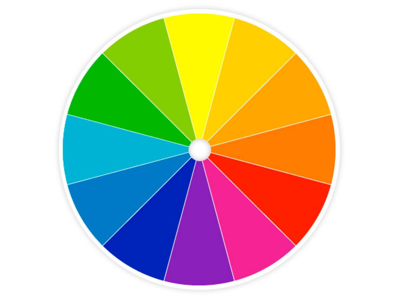
The articles discuss how blue and orange are on opposite sides of the color wheel which makes them
complimentary colors, causing them to pop in the poster image.
'There's a very simple answer for why there's always so much orange and blue in
movies, and it all starts with skin tone. Human skin tones generally fall somewhere in
the orange spectrum.'
We can see the average rating decrease from 7.17 to 6.24 from its peak in the 1920s to
2010. Perhaps this is a macro version of the same trend we see with movies and TV show ratings,
which tend to decrease over time.
It is fairly common for many movies and TV shows to have a relatively high rating when
they first appear, only to have the rating go down over the following months.
People who are more eager/interested in the title (and therefore more likely to be
inclined to give it a good rating) usually go see it as soon as it opens or airs. The
initial rating therefore tends to be heavily skewed towards the high end of the scale.
Over time, the title is seen by a wider audience of casual viewers and attracts votes
from people who may not necessarily be fans of the genre or who have different
expectations and may therefore have a less favorable opinion.
There appears to be two ideas we can draw from this for our own movie poster:
1. We can consider adopting a 1920s color theme to maximize our IMDb rating to rekindle
the novelty factor as this was the era that had the highest average IMDb rating.
2. We can avoid following the trend to dark colors >58.2% and the use of orange and blue colors
>12.2%, as these trends correlate with decreasing IMDB ratings.
Color Spectrum of Movies by Genre
Figure 10: Color Spectrum of Movies by Genre.
In the above color spectrum, we can see that the Horror genre consists of 60.1% of black pixels and 11.0% bright colors (red,
orange, yellow, etc.) while the Family genre consists of 31.3% black pixels and 33.5% bright colors.
We can see an increase in percentage of bright colors as we transition into the light-hearted
genres.
What is the psychology of dark colors and how does it impact movie poster colors?
Alan Costall and Tom Clarke, from the Department of Psychology at the University of Portsmouth
explored the symbolism of colors in their 2006 paper Emotional Connotations of Color: A Qualitative
Investigation.
The responses obtained for black were consistent with the research of Adams and Osgood and
Wexner who reported that black is bad, strong, and inactive as well as powerful and
masterful.
About 69% of our participants regarded it as a symbol of evil, malice and death.
69% of the participants reported that both orange and yellow were "happy" colors.
Color psychology is the study of
colors as a determinant of human behavior. The article discusses how ancient Egyptians and Chinese
civilizations used colors as a method of treatment as early as 2000 BC. In the 20th century,
Carl Jung pioneered the field of color psychology exploring the meanings of color emotionally.
This demonstrates our long cultural relationship with colors and how different colors can elicit
a range of emotions.
Color Spectrum of Movies by Rating
Figure 11: Color Spectrum of Movies by Rating.
Next, we can split color spectrum into by IMDb ratings into three equal buckets Low (Less
than 3.3), Mid (3.3-6.6), and High (Greater than 6.6). For the low rated movies, the dark colors
occupy around 58.2% of the total spectrum. For high rated movies, the dark colors occupy 35.2%
of the total color spectrum. This is a result of the Horror and Action genres which have
an average rating of 4.89 and 5.72 respectively. In our prior analysis we saw that these two genres
contain >55% dark colors.
We can see that the average IMDb rating for the Animation and Documentary genre is 6.84 and 7.28
respectively. We can try to create an Animation or Documentary genre poster to maximize our
chances in achieving a high IMDb rating.
What is the highest possible rated movie poster?
Creating a Movie Poster based on our color analysis:
Recapping our analysis to maximize our chances in creating highest rated IMDb poster,
we will need to:
1. Recapture the novelty factor of the 1920s and mimic the 1920s color palette.
2. Use a lighter color palette with dark colors less than 52.2%.
3. Avoid the blue and colors greater than 12.2%.
4. Create an Animation / Documentary style movie poster.
I took a look at the top three rated movies which were Shawshank Redemption, The Godfather,
and The Dark Knight to draw some additional inspiration.
Since I only have MS Paint installed on my computer I will try my best to create a
movie poster following the criteria above to create...
"An Animated Documentary of the making of Dark Shawshank Godknight Part II"!
Our poster was able to achieve an IMDb rating of 6.9 and our algorithm was able to identify
the genre as a Documentary!
Clearly our algorithm was not impressed with my MS Paint skills!
Creating a Movie Poster based on a randomly generated image (brute force):
Another approach would be to randomly generate colors and pick the image with the highest
score. I used Python's random number generator and fed into the machine learning algorithm
for 100 iterations. With this methodology I was able to increase the IMDb rating
to 7.5 but the algorithm was not able to confidently classify the genre with only 64%
confidence as a Comedy.
Conclusions / Lessons Learned
It appears we cannot simply judge a movie from its poster alone as there is a much
larger signal coming from the movie's audio and visual, the dialogue, actors, the social
media buzz, among other dimensions not included in our analysis. What is interesting is that there
are signals within the poster which we can use to identify genres based on past poster
designs, and we have been able to confirm some long-term trends in the posters which others
have written about independently. For future iterations I would like to explore
improving the accuracy of the machine learning algorithms and explore other dimensions
such as number of votes, social media feeds, or trailers. Other considerations include
using different JavaScript libraries such as D3, or Python's DataShader for visualizations
of large datasets.
Can you try and beat my score?
I challenge you to create a movie poster and try to beat my score!
Please send your works of art to me at hirohoso@.